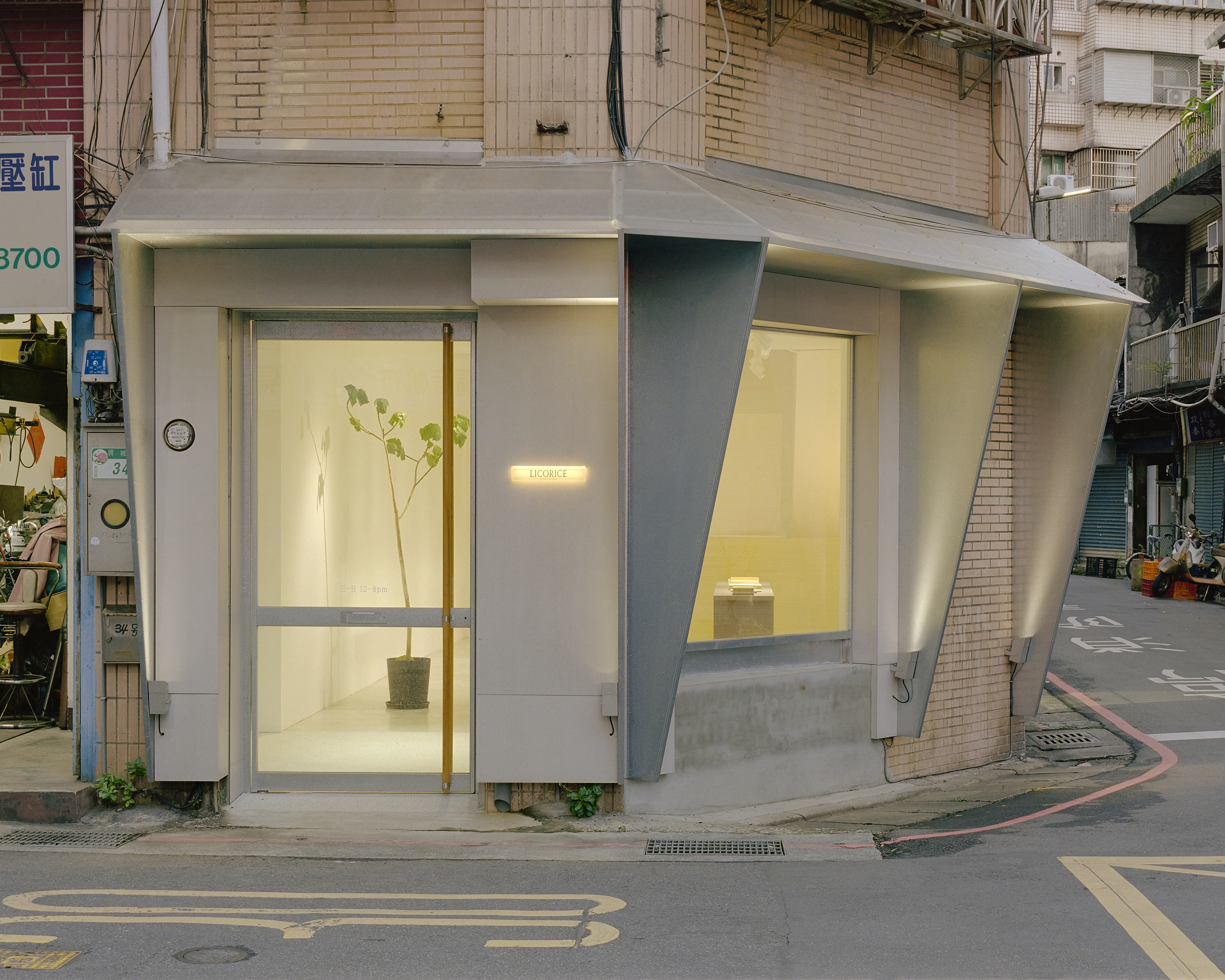


位於台北打鐵街的獨立書店,本案燈光設計以「城市可見性」與「空間性格」為核心,回應承德路沿線強烈的都市節奏與歷史語境。不同於一般設計初期多採用順應人流、強調舒適的照明策略,本案刻意選擇更具識別性的照明手法,透過建築外觀的金屬摺頁設計,打造遠距即可辨識的視覺焦點。

在外觀照明上,設計採用少量4000K投射燈,精準提升金屬摺頁的亮度與立體感。略帶冷白的光色呼應鋼鐵材質的剛性,使建築在夜間呈現俐落且具有力量感的輪廓,同時強調屋簷與幾何構成。這種相對「強硬」的光環境策略,使書店在街道中脫穎而出,建立清晰的品牌識別與空間記憶點,亦與打鐵街的歷史產業背景產生呼應。
面向街道的大面積透明櫥窗,則轉為更細膩的展示照明設計。室內主要使用高演色性4000K光源,避免泛光並精準控制光束角,使光線聚焦於書籍與展品之上,讓每一本書如同藝術品般被觀看。透過明確的光區配置,引導觀者自然沿著動線移動,提升空間的探索感與停留時間。

在機能與氛圍的轉換上,櫃台區域搭配3000K暖色小檯燈,形成視覺上的溫度落差。此一設計不僅清楚界定服務核心,也在整體偏冷的空間語彙中注入親切感,使顧客在進入與停留時能感受到適度的溫潤。
書店後方的後場空間,雖非開放區域,仍被納入整體照明敘事之中。設計透過兩個層級的光環境,增加空間深度與視覺層次。首先,格子狀玻璃後方配置線性3000K光源,營造柔和且具有節奏的背景光;其次,在更遠端的端景位置,以4000K較高亮度的投射燈照亮矮牆上的展示物。當光線穿越格狀玻璃,形成若隱若現的影子,進一步延伸空間尺度,強化視覺穿透性。


整體而言,本案燈光設計在「剛性與柔性」、「展示與引導」、「外部識別與內部體驗」之間取得平衡。外部以高對比與精準投射強化建築語彙,內部則透過色溫與光質的轉換,塑造層次豐富的閱讀環境。這座位於打鐵街的獨立書店,不僅是一個販售書籍的場所,更透過光的設計,展現出隱藏於鋼鐵街區中的細膩與溫柔。
空間設計: Marvelous Studio 馬福樂思工作室
燈光設計: UnderLiight
空間攝影: Studio Millspac
Located on Datie Street in Taipei, this independent bookstore lighting design centers on “urban visibility” and “spatial identity,” responding to the dynamic urban rhythm and historical context of Chengde Road. Unlike conventional early-stage lighting strategies that prioritize uniform comfort and human-centric illumination, this project intentionally adopts a more distinctive approach. By emphasizing the building’s folded metal façade, the design creates a visual focal point that is recognizable from a distance.
For the exterior lighting, a minimal number of 4000K spotlights are used to precisely enhance the brightness and three-dimensionality of the metal folds. The slightly cool white tone reinforces the rigidity of the steel material, giving the building a sharp and powerful nighttime presence while highlighting the roofline and geometric composition. This relatively “strong” lighting strategy allows the bookstore to stand out within the streetscape, establishing a clear brand identity and spatial memory that resonates with the industrial heritage of Datie Street.
Facing the street, the large transparent storefront shifts to a more refined display lighting approach. Inside, high color-rendering 4000K lighting is applied with controlled beam angles to avoid glare, allowing light to precisely focus on books and displayed objects. Each book is presented almost like an artwork. Through clearly defined lighting zones, visitors are naturally guided along the spatial circulation, enhancing both exploration and dwell time.
To balance function and atmosphere, the counter area incorporates 3000K warm table lamps, creating a subtle contrast in color temperature. This not only clearly defines the service zone but also introduces a sense of warmth into the otherwise cooler spatial language, offering a more welcoming experience as visitors enter and engage with the space.
The back-of-house area, although not accessible to the public, is still integrated into the overall lighting narrative. Two layers of lighting are introduced to enrich spatial depth. Behind the gridded glass, linear 3000K lighting creates a soft and rhythmic background glow. Further beyond, a brighter 4000K spotlight illuminates display objects on a low wall. As light passes through the patterned glass, it casts subtle shadows that visually extend the depth of the space and enhance its sense of scale.
Overall, the lighting design achieves a balance between rigidity and softness, display and guidance, as well as exterior identity and interior experience. While the exterior employs contrast and precision to articulate architectural character, the interior uses variations in color temperature and light quality to create a layered reading environment. This independent bookstore on Datie Street is not only a place for books, but also a spatial expression of quiet softness embedded within an industrial urban fabric.